Upgrading Peppertap’s grocery shopping experience
PepperTap is a hyperlocal grocery delivery service which started in November 2014 with a goal to provide it’s users a quick and seamless grocery buying experience.
My role
I led the redesign of the customer facing flagship apps on both iOS and Android platforms. I collaborated with iOS and Android developers, Data analyst and a Product Owner.
The challenge
The customer facing apps were seeing low engagement, a high drop-off rate on first app launch and high numbers of abandoned carts during checkout.
Analysing the metrics
I started with a data analysis on existing product categories based on their share in orders in the last quarter.
As a highlight, some sub-categories were leading the pack in terms of the order shares, e.g. Fruits & Veggies at 37% of the order share indicating this was the top category that our users were looking for more frequently.
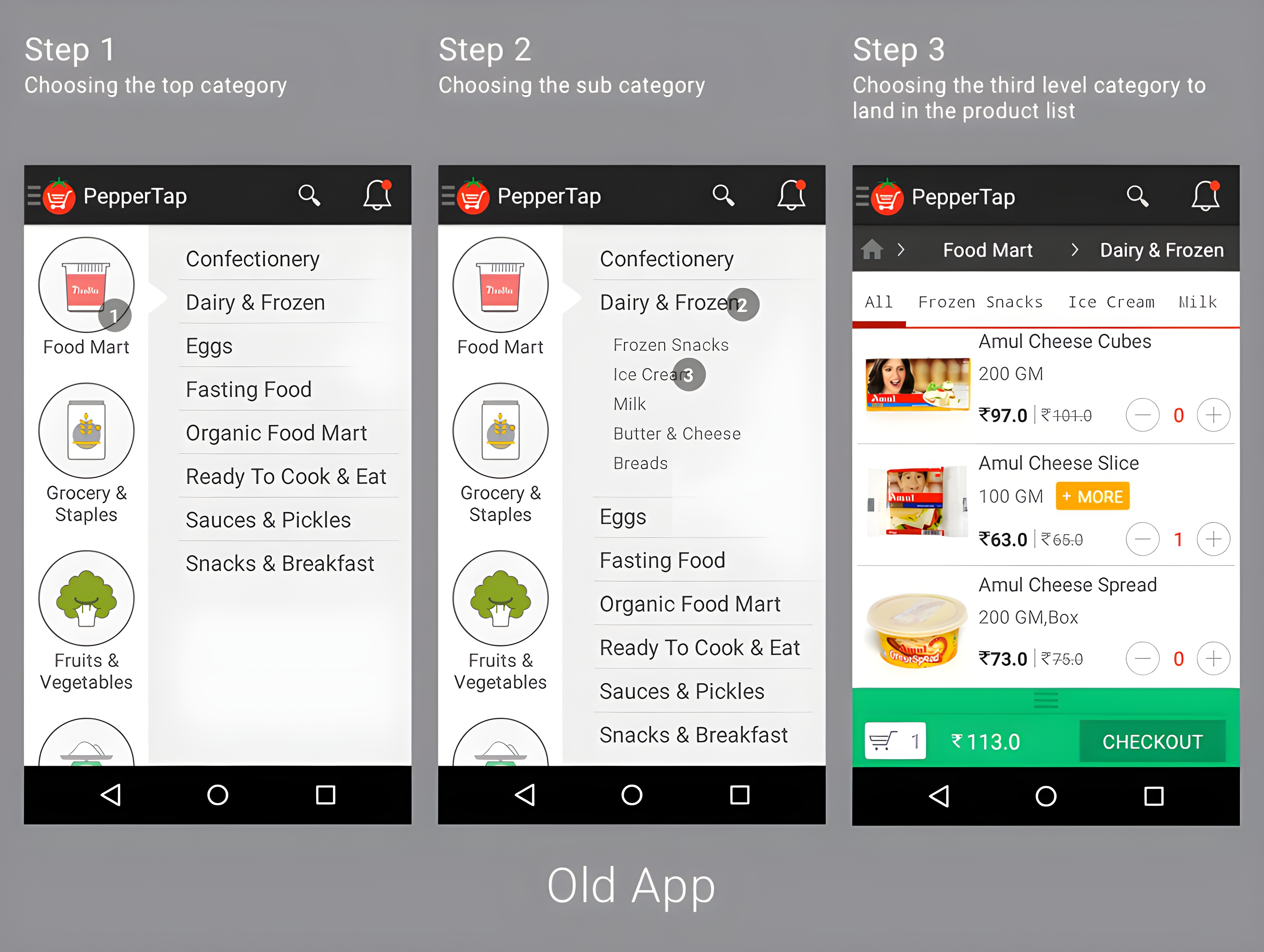
Auditing the old app
I followed up the data analysis with an audit of the old app. As a key highlight, there was a multi-step navigation structure from the home screen which made users take three decisions before reaching the actual product list, we had to think of a way to reduce this cognitive load to the bare minimum.
User testing
Following the audit, I set up some tests on usertesting.com to gather feedback from our users on the existing app flows.
Among other findings, we observed that the users found it cumbersome to move through the product categories owing to the multiple levels of categories they needed to traverse through, it was hard to find the product they were looking for unless they found the search function, not many users spotted the search icon in the toolbar either.
It was clear that a simplification of the experience was needed.
Refining the category experience
Leveraging user feedback, key metrics, and a comprehensive audit, I embarked on refining our product categorization.
I strategically reorganized the categories based on their order popularity to enhance discoverability. Noticing that certain sub-categories were excessively granular, I merged them to create a more intuitive and streamlined category framework. Collaborating closely with the product owner and consulting with our founders, we established the optimized category structure.
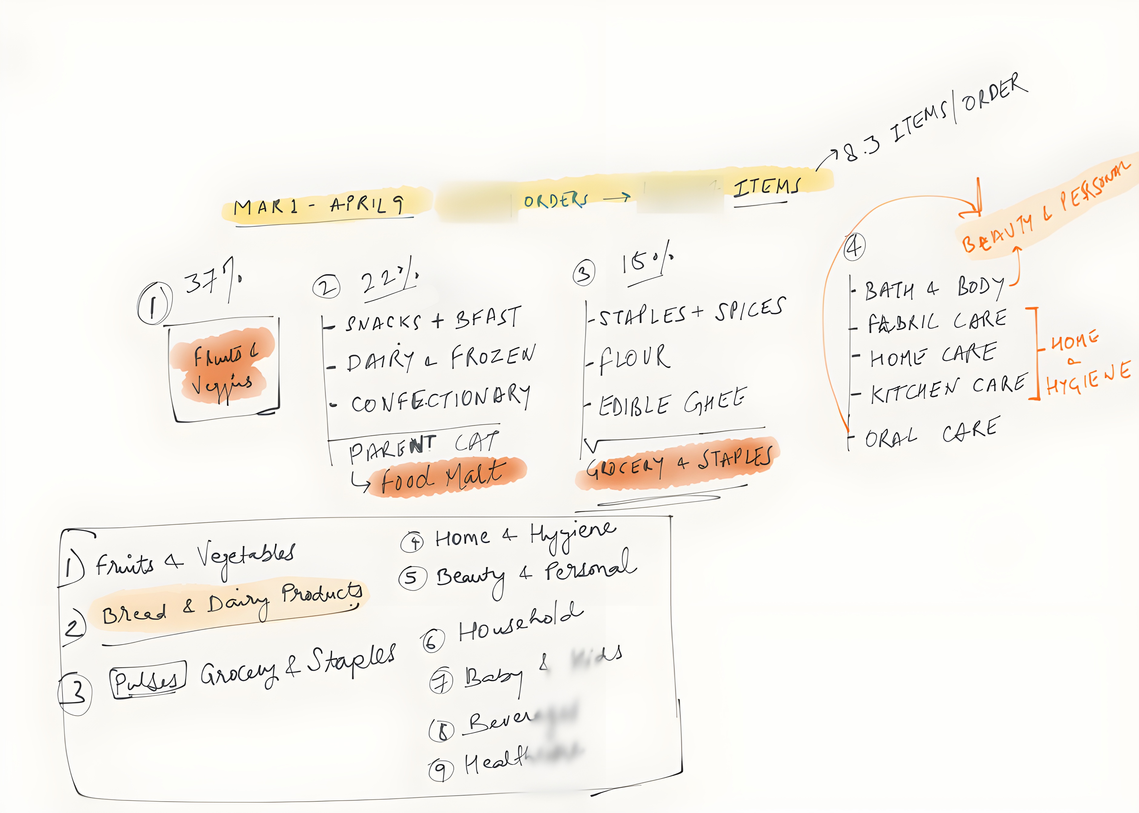
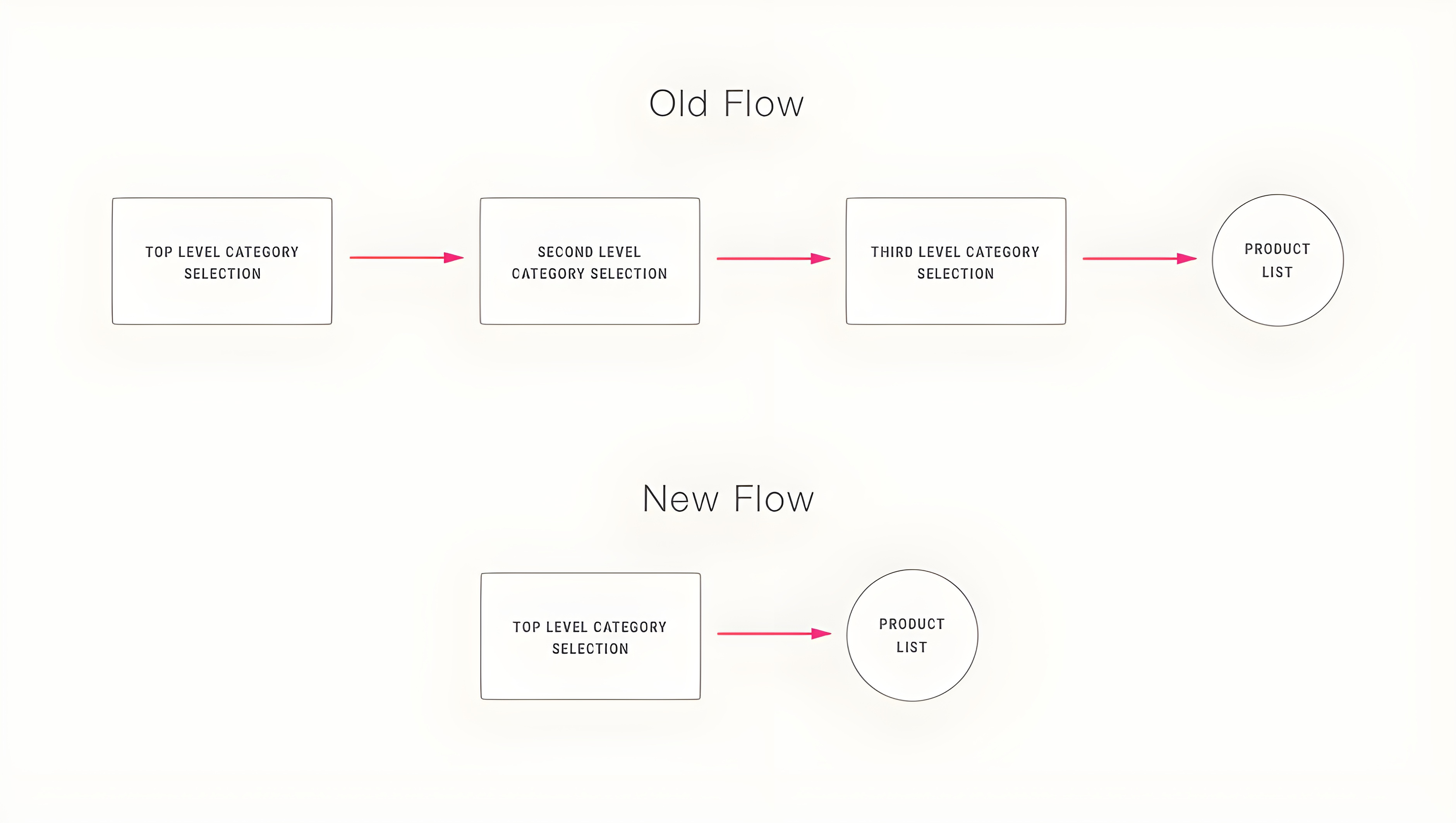
Above is the gist of the final notes that contains the restructured categories that we decided to go ahead with in the new app, the category count had now reduced to 9 with an average of 5 sub categories each, also the categories were 2 levels deep now instead of the previous 3 thus effectively reducing the choices the users had to make to reach the products.
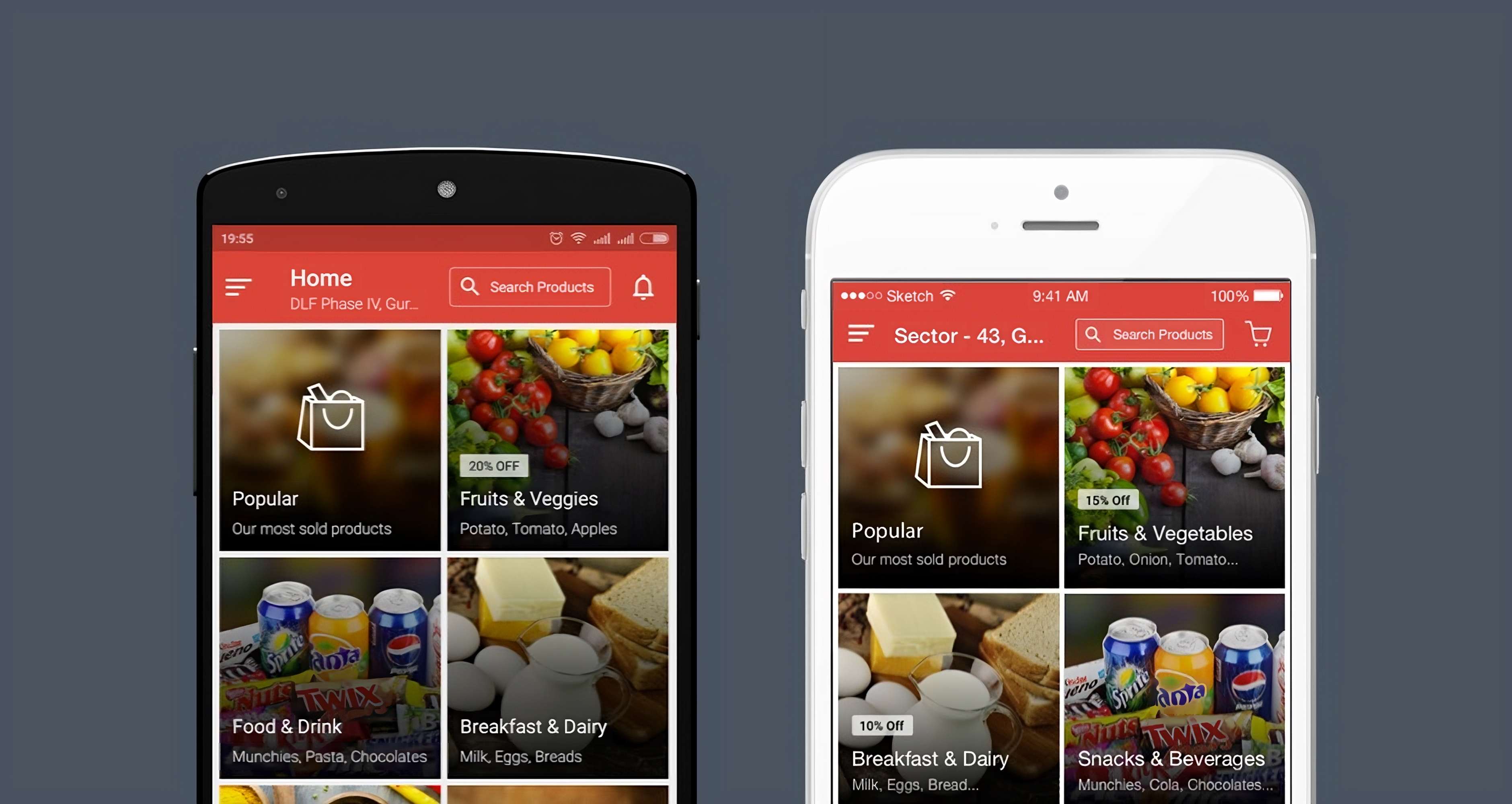
Keeping it simple
Now that we had a simpler category structure, I worked on the home screen to come up with a simple tile based layout that would greet the users with a choice of top level categories.
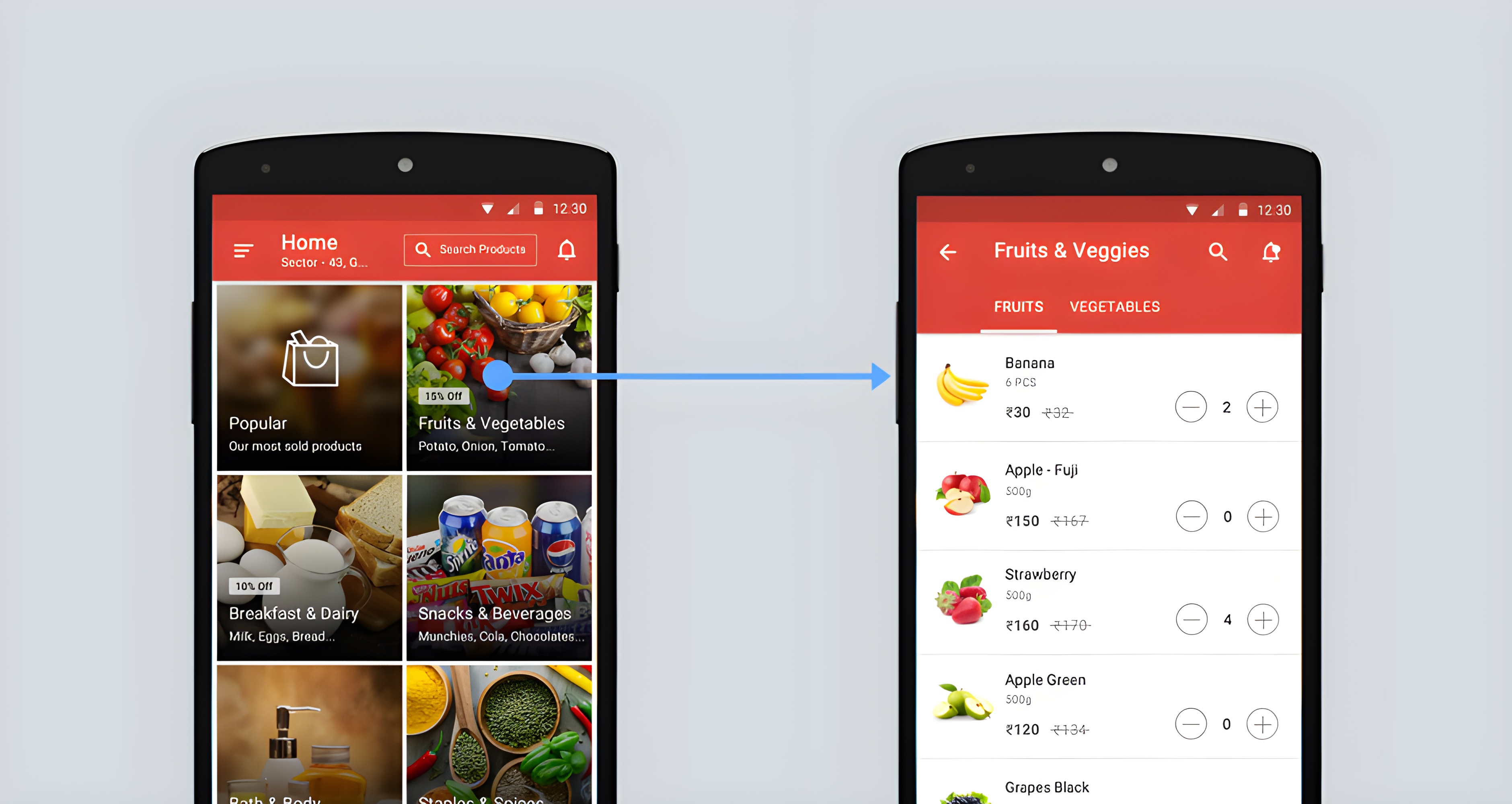
I chose a red palette as it was not only consistent with our brand identity, as reflected in the PepperTap logo, but it also evokes a sense of urgency and excitement. In the context of grocery shopping, this can subconsciously encourage users to make purchases.
Also, red is often associated with fresh produce like apples, tomatoes, and peppers, which can resonate with the idea of fresh groceries. By using red as our base color, I aimed to create a cohesive brand experience, stimulate user engagement, and subtly emphasize the freshness of our offerings.
Optimizing the checkout flow
Understanding the importance of the checkout phase in our user journey, I designed a streamlined checkout flow for our mobile app, eliminating any superfluous distractions.
Given that statistically, mobile users have higher bounce rates compared to desktop, it was important to ensure that I focus on minimizing the checkout steps and using smart defaults based on our data where possible.
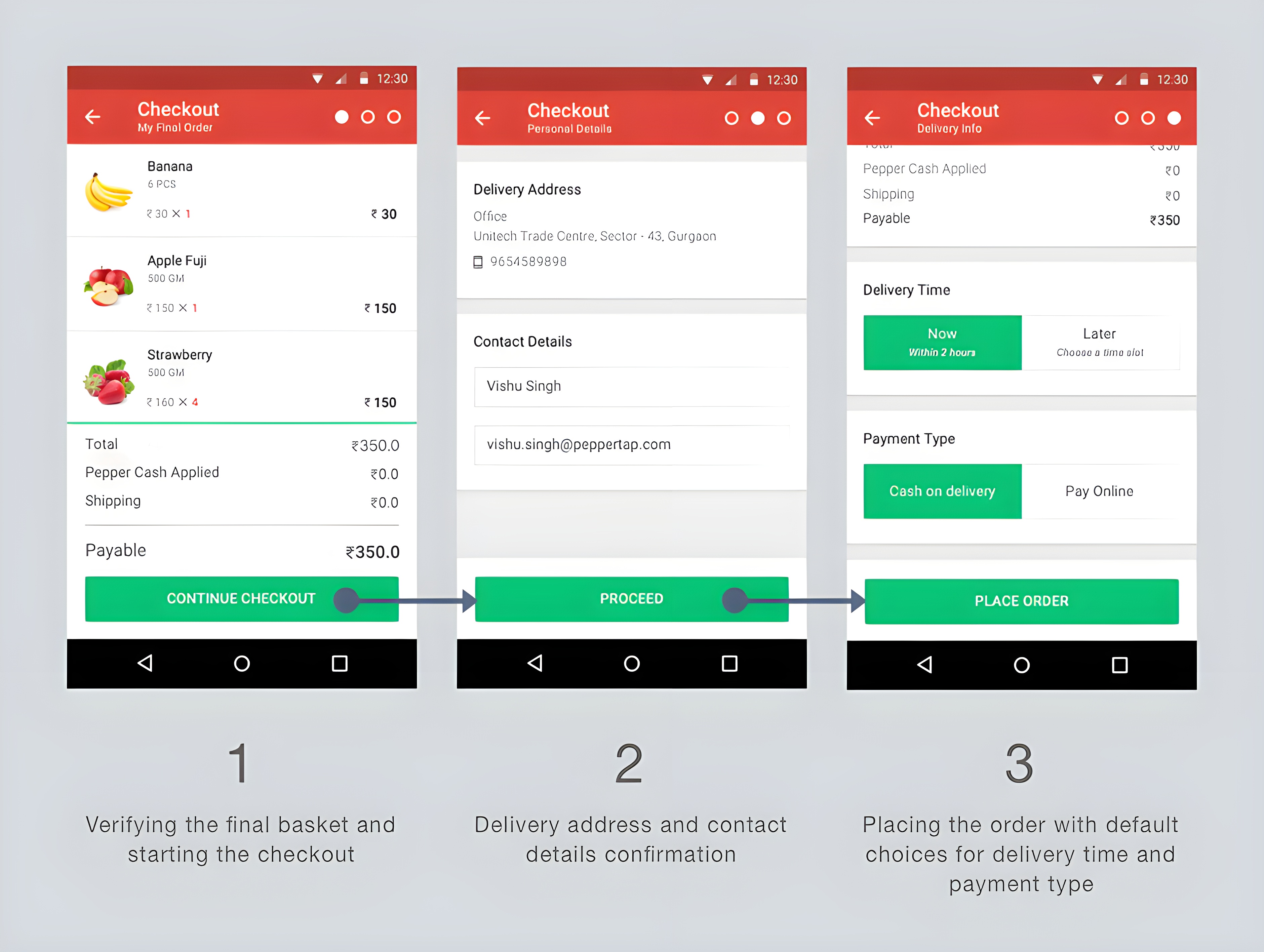
Using our data, I set default choices for delivery times and payment methods to make the checkout faster. Most users chose 'cash on delivery' and the earliest delivery slot. If users change their payment method, we'll remember it for next time, making things even smoother
I then went through a series of iterations based on feedback received from in-person sessions and tests run on usertesting.com
The Result
On launch, the redesign exceeded our expectations with a double digit percentage decrease in bounce rates in the shopping flow. We also saw increase in successful checkouts and a decrease in abandoned carts.