Converting your LinkedIn profile into a visual journey
At SlideShare we were gearing up to enter the content creation space, the start had to be with a product that is really simple and quick; provides instant gratification to our users while maintaining a high level of design sophistication and quality in terms of overall user experience across devices.
How do you design a content creation experience that is light in terms of cognitive load while rewarding users with high quality results?
We weren’t so sure about that at the time but were going to figure it out through a series of experiments, research interviews and design iterations.
Audience
The target audience of this product were the users who had not uploaded any slideshares in the past and could use a slight push towards a new paradigm of creating and publishing content online and potentially convert to regular uploaders.
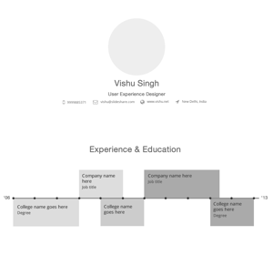
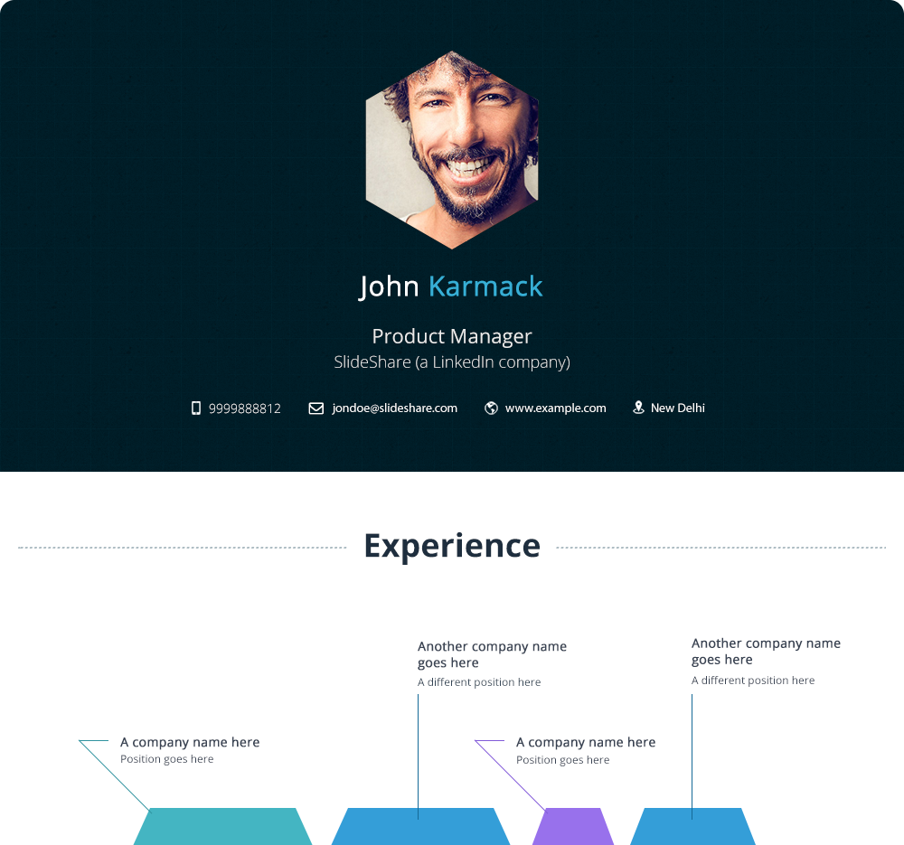
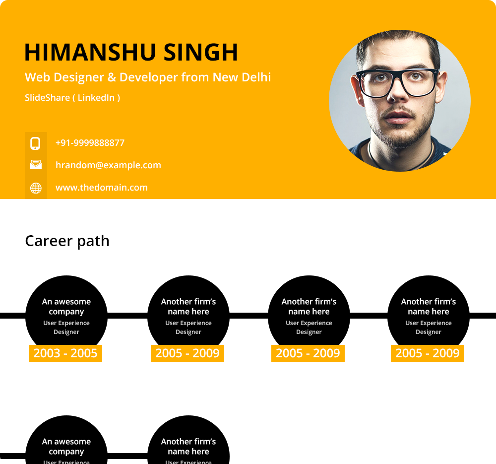
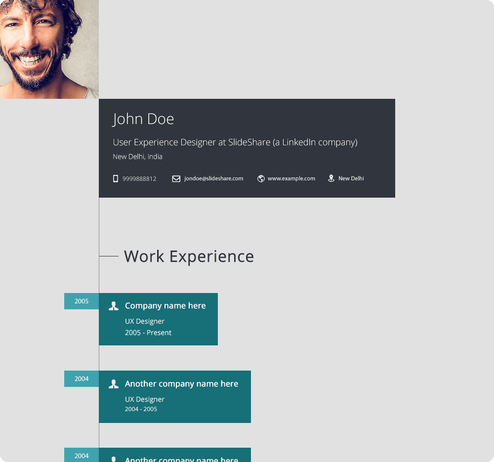
SlideShare user base mainly comprises of students, scholars and professionals from all over the world and there is one source of information that is common among them, their resumes.
Resumes are a rich source of professional data about an individual & LinkedIn is the largest professional network so using profile data to build an interesting visual story made sense.
Research
We conducted interviews with HRs to get a sense of the right hierarchy of data in a resume, the result had to be something that while being highly creative also had a well defined structure to it.
First step in this exercise was categorising data that comes in via the LinkedIn API, following is a mindmap that while helping getting the structure right also categorises data based on the insights from the interviews conducted with the HR team.
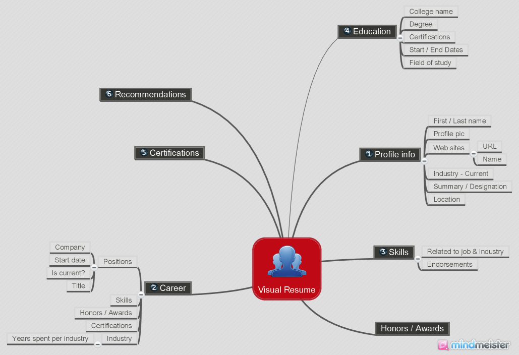
It helped us to get a sense of the IA that we were working with, the overall structure of this information was going to play a key role in arriving at the final result. Also this was the first building block of the visual explorations to come.
Static vs Interactive
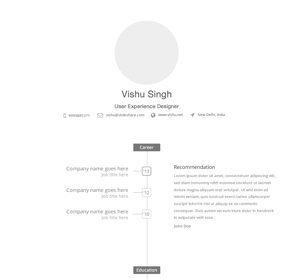
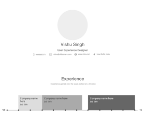
SlideShare player does not display dynamic views, it was built keeping presentations in mind; that makes it an ideal choice to display static data, void of any sort of interactions.
For us this meant the final visualisation could not have hover states, animations, hide/reveal information based on certain actions. These constraints shaped earlier design explorations, focus was on a design that lays out information in a flow, we were thinking about interesting visualisations in the form of creative timelines, shapes, charts and graphs etc.
The Pivot
When designing static visualisations we realised that a truly engaging experience can be achieved if the theme was alive in the form of markup and css/js, data could be laid out in a whole lot of interesting ways and multiple states could be leveraged to surface it. Animations could be used to make interactions engaging and in general a whole new world of opportunities could be leveraged.
Engineering team worked around this and made modifications to the player code to come up with a simple solution, a native html theme could now be loaded in an iframe and embedded in the player.
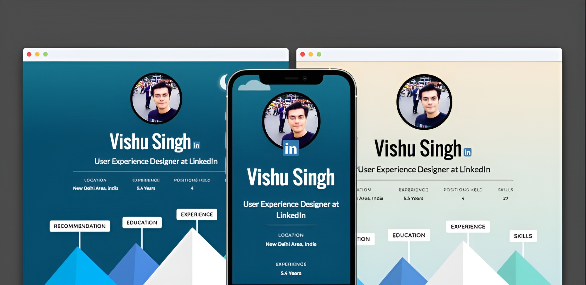
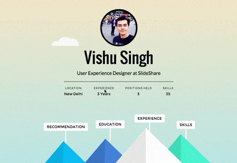
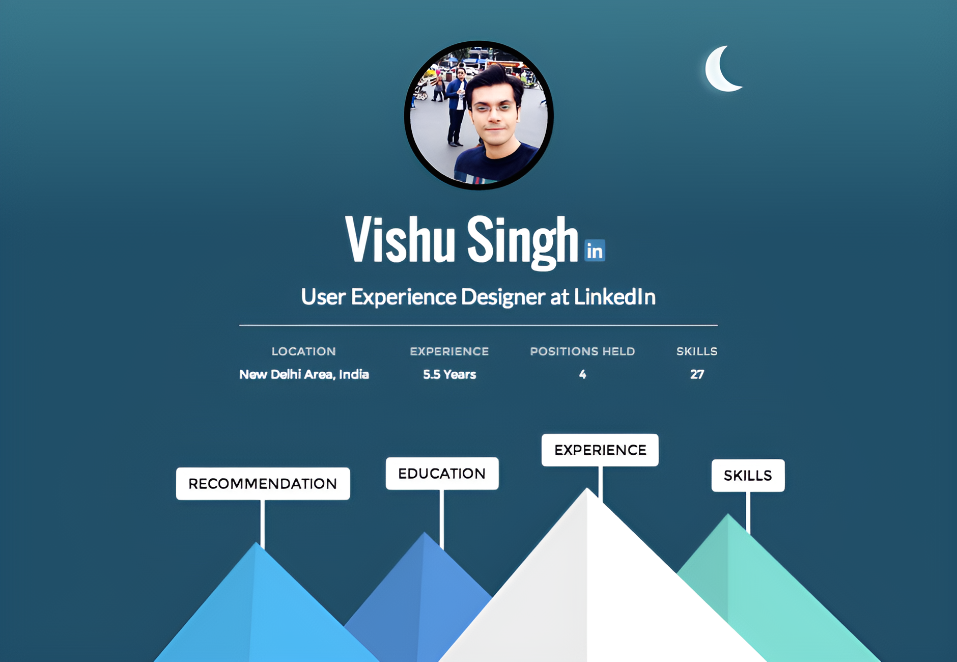
We moved on to prototyping solutions that involved multiple states, I started working on a concept that converts a LinkedIn profile into a playful landscape of your life, complete with picturesque illustration of sky, clouds and peaks. The concept was about mapping the key sections of the resume to their respective peaks and revealing information through intuitive interactions.
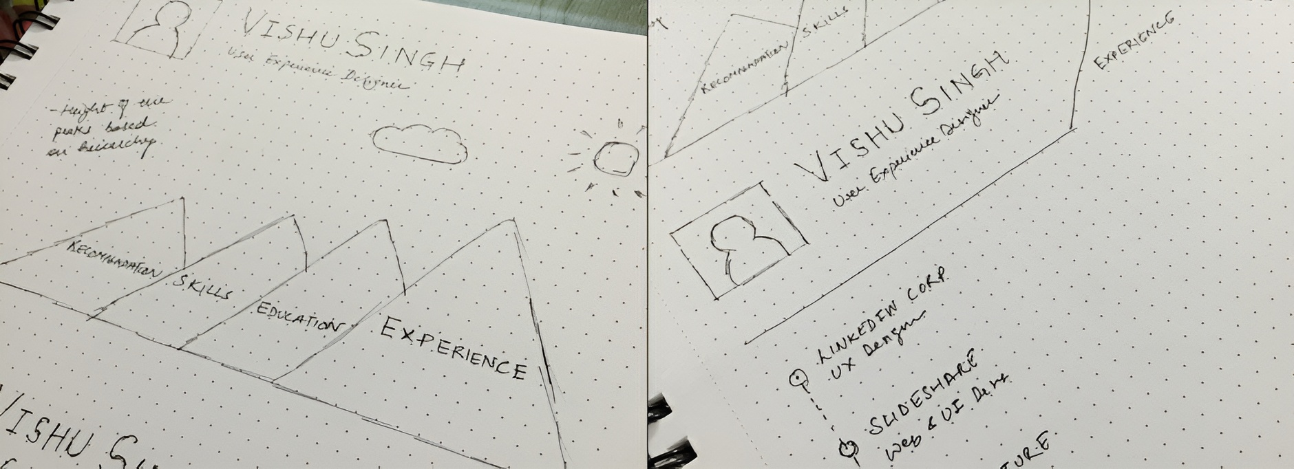
Learnings from UX interviews and hierarchy of information helped structure the layout here as well, relative heights of the mountain peaks followed that IA, the most prominent one being the experience section.
To keep a playful theme, I worked on a night version of the theme, professional journey auto switches to night mode based on local time.
For the theme to work on mobile devices it had to mould into a simpler experience, something which feels natural when being viewed on a device with smaller screen and lesser processing power.
The solution that I came up with was a scrollable version in which the sections are stacked based on the planned hierarchy and animations limited to the clouds.

Results
Statistical analysis during project planning indicated that around 10k professional journeys would be created every month provided the project is successful.
30K journeys were created in a month post launch, crossing expectations by 3X.